Pages - Menu
▼
Friday, December 7, 2018
STUPEFYING STORIES 22 • It’s really real!
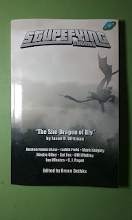
The proof copy finally arrived last night. It looks GOOD!
Cover finish is nice and glossy, cover art printing is sharp and clear, colors are rendered correctly, binding and trim are perfect, and the interior text is clean and crisp. Even the interior illos turned out well—except for Mark Keigley’s author’s photo, but that was weird to begin with. But in sum, the finished book LOOKS REALLY GOOD! I even like the color and texture of the paper.
Whew. That’s a relief.
Now if only Amazon would link the listings for the print and Kindle editions. We’re working on that.
As for those of you wondering why all the angst over this—especially you, Henry, and “Why not just use Vellum?”—it has to do with the crispness and clarity of the text on the page. I have a long background in print, going back to the days of actually casting lead type using a Linotype machine, and I can see the difference between 150 dpi and 300 dpi print. I find the soft, very slightly fuzzy appearance of most desktop publishing output to be fatiguing to read for long periods. By using the software and drivers I chose, I can get lossless PDF output at 600 dpi, and as nice a package as Vellum is, it seems no one makes a lossless PDF printer driver for Mac anymore.
Yeah, call me a perfectionist. Sometimes it's a virtue.
Going forward, the plan is to release all books simultaneously in print and ebook formats—though given the time-lag involved in getting Amazon to list print books, we’re going to have to re-juggle our book release schedule. We’ll also be putting our backlist out in print, going back to Stupefying Stories 15. Anything older than that is out-of-contract and out-of-print, though.


Schveet!
ReplyDelete