


And to be blunt, sales are a pretty damned good metric for measuring whether or not people are reading and enjoying what we publish. “Likes” and good reviews are all well and good, but numbers are what matter. And our sales numbers are not what I want them to be.
To improve our marketing, then, I have been sitting through a ghastly load of marketing webinars lately. I’ve already developed some pretty strong opinions on what makes for a good webinar. Most of them more honestly should be labeled infommercials, as they have about ten-percent useful content and ninety-percent saccharine enthusiastic fluff combined with pressure to upsell you to the next webinar, where the presenters promise to actually deliver all the information they’d said they were going to deliver in this webinar but didn’t. Fool me once…
Once in a while, though, I get into a webinar in which I learn some useful things and leave with some solid insight into what we’ve been doing wrong and how we can improve. Among other things, one of the areas in which I’ve realized I have been doing things really wrong is in our approach to cover art.
For example, consider PRIVATEERS OF MARS. While I am not 100-percent satisfied with this art, I thought it got pretty close to the concept I thought would sell the book. If you read the book, this art suits it. The reviewers pretty much all got the concept: this is a sci-fi space western and a novella for people who still miss Firefly and Malcolm Reynolds. I think my favorite reviewer comment was that this book reads like three episodes of a really great TV series you wish someone would make.
If you read the book…
That’s the rub. The print edition makes a great artifact. If you were to see it on the racks in a bookstore somewhere, you’d probably want to pick it up and take a closer look. Once you skimmed page 1, you’d probably be hooked on the characters and the story and want to buy it.
A bookstore. How quaint.

What do you see? A brownish blob on a brownish background, with the word “Mars” as the only thing that’s readable? Not exactly enticing, is it?

Meet Jacob Rhys: scoundrel, brawler, gambler, drunk, and licensed privateer working for the Free Mars State—until the authorities on Ceres seized his ship…
I liked the original cover. I liked working with the artist, to get a unique, commissioned piece of art that (mostly) represented what I thought would entice people to take a closer look at the book.
But if I want to sell books in the reality of Amazon’s world, the cover is the first thing I need to change. Perhaps to something more like this:

Go ahead. Click through. Never mind the “Look Inside” mess; it doesn’t look like that on my Kindle. (If you’re a Kindle Unlimited subscriber and it does look that bad for you, please, let me know.)
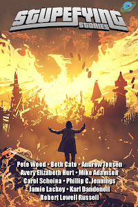
Cover art. Just one of the many things I’ve learned I need to change if we’re to improve sales and reach a bigger audience. Stay turned for more.
—Bruce Bethke
1 comments:
Instant response:
Thumbnail: saw some kind of laser beam blasting something else and was interested.
Large Picture: saw a laser beam from one ship blasting another ship in a titanic space battle!!!!
Clicked on BIG image, saw the same thing you'd just written, so clicked on LOOK INSIDE! and saw a GIANT T covering letters. Read it as well as I could, but while interested, not THAT interested...though Space Opera is something I prefer as a movie/on TV, not in my reading. I'm more a "hard SF" kind of guy...
Post a Comment